Concluding Thoughts

Lectures and Photoshop Tasks:

I’m exceptionally happy with the amount of Photoshop tricks and editing skills that I have acquired over the past weeks working on the module. As a photographer who had no relation to or experience of Photoshop previous to this module, I’m quite pleased to say that I now feel confident in the carrying out of basic manipulation of images with Photoshop, as well as carrying out some more complex operations with the software. Although I now have this knowledge however, I feel that I need to keep up to date with Photoshop and continue to practise using the software. I guess it’s like anything else, now I have the knowledge and I understand the basics, practise and further experimentation will allow me to improve and become more competent with the program.

Photography of 10 Subjects:

Again, a few areas in here such as abstract, food and street photography that I’m not all too familiar with, but I’m grateful these subjects were included in the module to get me out of my comfort zone and shooting things that I wouldn’t usually have considered doing so. I’m happy with all of the images that I’ve supplied, including the way that they have been shot in camera and edited after. All but one image of the Eifel Tower in the street section that is, I hadn’t noticed until I received my book in the post that there’s dust on the image which I missed during processing, which is a bit disappointing, but it’s a lesson learned to check and double-check on future projects. Other than that though, I’m quite happy with how the shooting of the images has gone, I’ve tried to include as many interesting subjects and locations as possible in the given time, and tried to ensure that images have been taken in good time without the need for rushing.

Filing System:

Not something I’d usually talk about, but since it’s played a big part in this module, it’s worth discussing. I’m quite happy with how the filing system has worked out, as well as the naming system allocated for individual files. This isn’t something I’ve done in the past, but is certainly something that I will keep up in the future, the filing system has made work so much quicker and more efficient. Knowing where everything is at all times and been able to access it in seconds makes the small amount of effort required in making a good system worth the while.

All in all, I’m fairly happy with the way the project has gone, and hopefully the images provided will be up to standard, I’ve certainly enjoyed the challenges set and hopefully the images will confirm this.


Concluding Thoughts

Work Flow: Filing System.

Introduction:

As part of this module we’ve been told of the importance of keeping a good and well-kept filing system. It ensures that images don’t go missing, are easily accessible and allows us to work more efficiently having ease of access to images.

Filing System:

I have created a series of folders and a naming system for individual files, they’re explained below.

The naming system for files works like so, all files begin with the code ‘MER’ this is simply the entails of my first last and middle names. This is then followed up by a two letter code designated to a section. For example abstract images are given the code ‘AB’ whereas architecture images are given the code ‘AR’. So a file name such as ‘MERAB’ is an image belonging to the Abstract sector. Image files are then followed up by a four digit number showing their allocation within their designated section and finally a . and the file type code.

Filename Key:                                                                 File Type Key:

‘LS’ – Lifestyle                                                                .ARW – Sony RAW File

‘LD’ – Landscape                                                            .NEF – Nikon RAW File

‘AB’ – Abstract                                                                . PSD – Photoshop File

‘FP’ – Studio Portraiture                                              .tiff – Tiff File

‘SL’ – Still Life                                                                 .JPG – JPEG File

‘ST’ – Street Photography

‘AR’ – Architecture

‘WB’ – Objects on a white background

‘IN’ – Interiors

‘FD’ – Food

Folders:

The folder system is neat and simple. All Folders are Placed under the Main Folder, with a sub folder for each of the 10 subjects. Located in each folder are the individual coded image files, which work as explained above.

Master Folder –

10 Individual Subject Folders


Work Flow: Filing System.

Week 7

Introduction:

The main aim of this session was to learn how to use studio equipment and flash and to become competent in doing so, so that we are free to use the studio equipment without supervision in the future. To start with we had a discussion about on camera flash, talking about when it is best to be used and how in these situations to use it.

On Camera Flash:

On camera flash is a useful tool to have, it can be used to light up a foreground against a setting sun, illuminate an under exposed subject, or cast highlights and tones across the face of a subject during portraiture, there are many other uses for an on camera flash, but these are probably the three most common uses for it.

To meter for a flash we can use a hand held light meter, or, we can use a system called TTL metering. TTL (through the lens) metering, picks up light that has passed through the lens reaching light sensors near the actual imaging sensor itself, these light sensors pick up the available light and then make a calculation working out which settings would be best to correctly expose the imaging sensor in the available light. The camera can then process the addition of the extra light produced from an attached or on camera flash and change the settings again, this time compensating for the light from the firing flash.

Image temperature is measured in degrees Kelvin, lower temperatures (higher degrees Kelvin) create colder images, these images are more blue in colour. Warmer temperatures (lower degrees Kelvin) pass through the orange spectrum before becoming red. we can use colour filters called white balance to help remedy images that are coming out looking unnaturally warm or cold, we can also use filters that cover the flash or the lens to help remedy this problem. This is another benefit of shooting in the RAW format, should we for some reason make a mistake in choosing the wrong filter or white balance, in RAW we can revisit this and apply the correct filter during processing. This is something that cannot be done to the same extent if trying to Edit a JPEG or when working on negatives, where it is much more important to get the white balance right the first time around. This said, it is good practice to ensure that you get you image as close as possible in camera the first time around as this shows you are efficient in your work, saving time in processing. We can fine tune our white balance if we wish to, and we can get this information from a hand held light meter however usually the most important thing to do is to switch from auto white balance to the flash setting in your white balance menu, the camera, usually is very good at working out the white balance itself.

The use of colour filters was also described to us whilst on the topic of flash. A red colour filter placed on the lens of the camera at a sunrise or sunset will intensify the reds in the background and sky of the image. If a subject you are photographing is stood in the foreground of an image where a rising or setting sun is present the use of a green filtered foreground flash cancels out the effect of the red filter on the areas hit by the green flash. This will then create the effect of a normal coloured subject against an intensified red background.

Journal Task:

Our task for this week was to set up a shoot using two flashes that captured a subject sat working at a Mac with no flare and perfect composition and exposure. Firstly we had to set up two of the Bowens 500w Flash Heads onto their stands and get them working simultaneously. We did by using two heads, one set up as a master which would receive the message to fire from the camera, and one as a slave, the slave would fire when the message from the camera was received to the master, the master then relaying the message to the slave.

Our image was shot at 1/125th, F11 at ISO 100, the flash heads required some trial and error to ensure that they where firing at the intensity we required to correctly expose our image at our chosen settings.

As part of this task we where all given individual roles to play, my role for this task was team leader. I feel that the task did go well, and in the end we did manage to work as a team to create the image that we had been tasked with, the team was briefed at the beginning of the session and everyone was clear on what they had to do, despite a certain team member trying to their best to take over control of the shoot. The team worked well together and despite struggling to get the image just right for sometime we did manage to achieve the task in the given time.

The lighting diagram for this task can be seen below.


Week 7

Week 6

Our task for week six was to take two portrait images of an interior and then to stitch them together in the way you would a panoramic image. Once this task had been completed we where told to shoot 20 images around campus. These 20 images must then be individually edited using filters and different editing methods, once these images had been completed, they needed to be placed onto the wall of the original image. The completed image was then flattened, and resized to 300 DPI.

Here’s an illustrated guide showing how this is done:

Firstly we need to process our images from RAW to Tiff files for use in Photoshop, the files for this this peice where shot on my Sony A77MkII and are edited on Capture One for Sony Software.

Fullscreen capture 15052016 133710.jpg

Once our images have been prepared from the RAW format to a workable one for Photoshop, we then open up our image into photoshop to begin work. Once we’ve done this we double the width of the canvas off to the left. We do this so that we can drop the left hand side of the court in and begin working on stitching the two portrait images together.

Fullscreen capture 15052016 133928.jpg

When we’ve completed this move, we can then drop the second image onto the white left hand side of the canvas.

Fullscreen capture 15052016 134021.jpg

We should now align the two images and insert our guides from the ‘view’ menu on the toolbar. We insert the guides where our intersecting lines meet so that we have a straight guide to work by.

Fullscreen capture 15052016 134318.jpg

Now we open up the ‘edit’ tab and select transform, in this menu we then go to select the ‘distort’ tool. Now, like in last weeks task we work to align and straighten the distorted area, turning the two seperate portrait images into one large wide angle image.

Fullscreen capture 15052016 134516.jpg
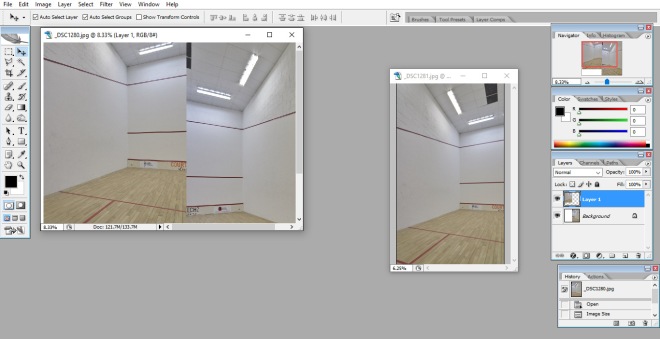
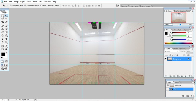
Sadly, my two images didn’t stitch perfectly together, a lesson learned should I attempt to do this in the future, to ensure that the two images are taken dead centre and as close to the centre of the image as possible regarding height, I took these two images slightly off centre whilst knelt down, and it has made stitching the two images together near impossible. Still, it’s an mportant lesson learned the hard way for next time.

Now that our two images have been stitched together it’s time for us to start creating our collage of 20 images, taken around campus. Each of these 20 images needed to have a filter or effect applied to them, before application to the wall on the side of our orginal image.

Fullscreen capture 15052016 134754.jpg

Fullscreen capture 15052016 134829.jpg

Once our filters and effects have been applied, we add our image to our collage canvas, using the free transform tool we then resize the images to the correct size.

Fullscreen capture 15052016 134844.jpg

The process of apllying filters and adding images to the canvas is continued until all 20 images are complete and present on the canvas. The image is then flattened and prepared to be dropped onto our orginal image of the court.

Fullscreen capture 15052016 140512.jpg

Now using the from transform tool, we resize our collage to a realistic size and use the distort tool to angle the image in a way that make it look like it is placed against the left hand wall, we do this by using the floor line and the red line as a guide for how the image should look leading into the distance.

Fullscreen capture 15052016 140623.jpg

The finished image is then flattened once more and saved as both a PSD file in the case of any fuure work been carried out on the image, and as a Tiff, ready for use.

Fullscreen capture 15052016 140749.jpg

Week 6

Week 5

Introduction:

During week five we looked into architectural and in interior photography looking at the methods used by photographers in these trades and how to shoot these particular environments.

We also had a look at the Samyang 24mm tilt shift lens and the ‘toy town’ effect that you can achieve from using it.

We where shown the works of illusionist and photographer George Rousse, who uses patterns and colours to create images that change the way the viewer sees the interiors presented before them. Although I personally don’t really see the much interest in the work of Rousse, it was still eye opening to see what spins and themes you can throw onto areas of photography.

When shooting interiors as a rule, wide angles are used to show as much of an inclosed space to the viewer as possible, lenses between 14mm and 28mm are the norm for this type of work. Wider lenses could be incorporated into this work but lenses wider than 14mm are getting into the range of the ‘fish eye’ lens creating unwanted distortion in images. ISO’s should be low to create clean quality files, and apertures as a rule should be kept around the F8 – F16 mark getting the whole scene into focus for the viewer, this approach to interior photography will land you with the best results as but will usually require the use of longer shutter speeds, therefore a tripod would usually be required.

Journal Task:

Our task for this week was to shoot a series of images featuring a building, car park, bike shed, plane, overhanging branches, a person and a moving building. We where given 45 minutes to shoot these objects before returning to lecture to be briefed on what to do next.

Our task was to create a single image in which we would place all our images in, this image must then be edited in way that would make the viewer believe it had been taken as one image with a shallow depth of field as opposed to multiple images stitched together. we would do this by re sizing images and placing them smaller in the distance and larger in the foreground to give a sense of size and scale. Whilst doing this we would add blur filters, adding a stronger blur to images in the back ground and a weaker blur to foreground images, giving the sense of a shallow depth of field.

The task is illustrated in a series of screen shots below:

The first thing we need to do, is process our RAW files to Tiffs so that we can use them in Photoshop. I use Nikon’s own software View NX2 for doing this.

Fullscreen capture 14052016 132905.jpg

Next we open up our base image, ie the image in which we wish to build the rest of the images upon. This image is of course the front of the university building, also including the sky and ground.

Fullscreen capture 14052016 134942.jpg

The building itself is a little distorted, in order to remedy this we first go into the ‘view’ section of the toolbar and select guides. We then add four vertical guides and two horisontal so that we can straighten up our image and have a solid vertical in which to ajust distortion to.

Fullscreen capture 14052016 135134.jpg

Fullscreen capture 14052016 135359.jpg

Once our image has been straightend, we can open up the ‘Edit’ tab on the toolbar and select transform, one of the transform tools is labled distort and this is the one we need to select to level our the ends of our building and cancel out any lens distortion.

Fullscreen capture 14052016 135647.jpg

Below we can see the edges of the building have been straightened and are now straight by the guides.

Fullscreen capture 14052016 135746.jpg

Once this had been completed, we could start to think  about adding our first objects. The first object that I decided to add would be the aircraft as the aircraft and the building will both share the same amount of bluring both as they both share the background space. It is important to layer things up from back to front, otherwise issues will begin to form at later stages.

The aircraft was easy enough to cut out, it simply required the use of the magic and tool and ragging across from one layer to the other. Some of the more complex images required the use of the clone stamp, lasso and earser tools to cut them out. This is demonstrated in week three’s journal task.

Once the aircraft has been dropped into the image we again use the free transform tool to correctly re-size and re-position the aircraft on the canvas.

Fullscreen capture 14052016 140010.jpg

Fullscreen capture 14052016 140155.jpg

Once aircraft has been placed we go into the ‘layers’ tab on the tool bar and select the flatten image button. This merges the image of the aircraft and the building into one.

Fullscreen capture 14052016 140312.jpg

Now we can add our bluring effect to the image, usually we’d do this before flattening the image, however, as these two items are sharing the same amount of bluring, it makes sense to flatten the image first and apply the same blur to the one image rather than the two seperatley.

The blur effect that is used to create the feel of shallow depth of field is the Gausian Blur tool, and at around a 4.2 pixel radious gives the feel of a wide apature of around F2.8 been used.

Fullscreen capture 14052016 140217

Fullscreen capture 14052016 140348

This process is now repeated for the rest of our images, until we build up our final image. As we are trying to recreate an image shot at a large apature however, it is important that we reduce the bluring effect on objects as they become closer to the foreground, that is until our very last image of the subject which should be pin sharp with no bluring effect applied. In the same sense, items should be placed and free formed to a size that looks natural depending on there position placed in the image. Giving a sense of natural size perspective, ie. Forground items large, background items, small.

Inclusion of the bus.

Fullscreen capture 14052016 141321.jpg

Inclusion of the cars.

Fullscreen capture 14052016 143242

Inclusion of the Shelter.

Fullscreen capture 14052016 150807

And finally, the inclusion of our subject.

Fullscreen capture 14052016 160139

The finished article is now saved as a PSD file, incase we should wish to re-visit the image at a later date for further editing, and as a Tiff, creating a nice large file for use with our customer/project.

Week 5

Week 4

Introduction:

Our task for week four was to set up two Bowens 500w flash’s as instructed to in week 3, it was then up to us to take 5 portraits of each person in our 4 person groups pulling funny facial expressions. These portraits where shot at 1/125th, F16, ISO 100 with the aid of the Bowens flash. We used a Sekonic flash meter to give us the correct camera settings to expose correctly with the use of the Bowens on its selected power rating.

Sadly I lost my original face swap and donor portraits, to show my understanding of the process however I’ve done a quick illustrated guide below showing the process and that I under stand how this is done.

Firstly we load our already processed from RAW to Tiff files into Photoshop. We select the portrait which we want to work on first.

Fullscreen capture 15052016 150931.jpg

We then load up our image size menu to take a reading of the size of this portrait.

Fullscreen capture 15052016 151006.jpg

The image is 25x30cm. We now load up our canvas size and go on to increase our canvas size by +25cm in width to the left, making the canvas size now 50x30cm.

Fullscreen capture 15052016 151055.jpg

When this has been completed, we can proceed to drop our second ‘donor’ portrait into this space.

Fullscreen capture 15052016 151104.jpg

Fullscreen capture 15052016 151203

We now flatten the image, merging the two portraits into one image, when this is done we unlock the layer add a set of guides lining up the eyes and mouth and set to work trading features using the clone tool.

Fullscreen capture 15052016 152456.jpg

We then add another blank canvas to the right side of the original image this side, in order to add in a second donor portrait, now increasing the canvas size to 75x30cm.

Fullscreen capture 15052016 154245.jpg

We can now add in our third portrait, remembering to flatten the image when done and proceed to use the clone tool to ake and use further features.

Fullscreen capture 15052016 154322.jpg

Now that this has been completed And more features have been added to our original portrait, we can crop the other two portraits out, leaving just our altered one. This can then be saved as a Tiff and ready for whatever sort of bizzaire use you may have for it!

Fullscreen capture 15052016 154814.jpg

Fullscreen capture 15052016 154837


Week 4

Week 3

Introduction:

Week three would become our first opportunity to learn about flash photography, we would watch a demonstration showing us how to take a polaroid photograph as well as how to set up a Bowens 500 Watt flash. After the demonstrations we where given the task of photographing an object that we had brought in using our cameras coupled to the Bowens 500w flash and on a white background. After this we had to use photoshop to cut out our photographed objects and then place them onto a pure Adobe RGB white background. After this we then took a copy of our cut out object and placed it, so looking realistic into another environment which we had shot earlier on in the day. A demonstration of this task is illustrated in screen shots below as well as well as a copy of the finished product.

Firstly here’s a copy of my first Bowens flash assited portrait, shot at 1/125th, F16, ISO 100.

_MER1634.jpg

Journal Task: Placing an object into a seperate environment

As mentioned above, our task for this week was to photograph and onject that we brought in with us, and then to photograph a seperate environment in which to place our object. I chose to photograph my Nikon F3 and decided to use my window sill at home as the environment in which I’d place it. Below is an illustrated guide showing how I completed this task.

To start with, we need to process our RAW files, converting them to Tiffs for use in photoshop. As this stage I also altered the contrast of the images and made them ready for use. Note how the image has been shot on a white back ground to help in the carrying out of this task.

Fullscreen capture 13052016 144440.jpg

Once this has been completed, we open up the image into Photoshop in order to begin work, cropping out any unessecary background.

Fullscreen capture 13052016 145350.jpg

Next we select the Lasso Tool and begin work neatly removing the back ground from the edge of the camera.

Fullscreen capture 13052016 145555.jpg

The complete image having removed all the background replacing it with Adobe RGB White.

Fullscreen capture 13052016 151249.jpg

Our next move is to us the magic wand tool to select the background area, I then made the Adobe RGB White background transparent, this however isn’t nessicary. Once the background had been selected, I right clicked the area and selected inverse, thus changing the selected area to the camera. I then opened up my second image and used the grab tool to pick up my camera and drop it into my second image.

Fullscreen capture 13052016 151838.jpg

Next we can maximise the image with our camera dropped into it and focus on this image. We can now use the free transform tool to resize and reposition our camera in the new environment.

Fullscreen capture 13052016 151937-001.jpg

Once happy with the cameras position, we can flatten then image, making the camera and the background into one image, combining the two layers into one.

Fullscreen capture 13052016 152433.jpg

The final move is to save our image as a Tiff file and as a PSD file. A Tiff as the finshed article and a PSD incase we should wish to re-visit the image at a later date.

Fullscreen capture 13052016 152609.jpg

The completed image.

MERPSD0001.jpg

Week 3

Week one, Introduction to Photography

Introduction:

During week one we not only learned about workflow, but we also had an introduction to the basics of both photography and image processing. During this introduction we learned about the exposure triangle the importance of the histogram and how to use it, and the importance of shooting in RAW and why we should only downgrade to JPEG for the use of file transmission and E-Mail.

The exposure triangle:

The exposure triangle is made up of the following three elements, shutter speed, aperture and ISO. In order to get a correct exposure it’s important that we balance these three elements, we can however push certain elements in the triangle to gain certain creative effects, but we need to understand that for every element we push there is a counter reaction.  For example if i want to shoot an image with a deep depth of field, I would select a small aperture for example F16. By choosing F16 however I’ve created a very dark space between the lens iris and the sensor/film. To counter this I either need to use a longer shutter speed and perhaps a tripod or boost my ISO/change film, if handheld. The same applies for the shutter speed and ISO, by manipulating one element you must also change another in order to expose correct. They’re are other ways around this such as the use of filters and digital manipulation, however this is a very basic look into the exposure triangle and how it operates.

The Histogram:

The histogram is a tool that shows us the levels of each colour present in our image, the histogram also works on a number scale, the scale on the histogram works between the numbers of 0 -255. Black or underexposed with no detail is found at the beginning of the scale at 0, burnt out white is found at the other end of the spectrum at 255. In theory any area displaying a number above 1 and below 254 on the histogram should have some amount of retrievable information to be found within it.

The best way to describe the histogram is that it looks like it has the appearance of a graph with a line through it. We can manipulate the ‘levels’ of each colour and the actual exposure of the image by physical grabbing this line and moving it. We can also manipulate the levels of an image by changing the values numerically, for example by changing blue from say 200, to 245 should give you a deeper shade of blue within the image.

This makes the histogram especially useful for making both experimentation and precision changes to both the colours in your image and the exposure of the image itself.

8 BIT or 16 BIT?

16 BITs is the colour channel that I have chosen to shoot my images at for this project, I have done this as a precautionary measure incase I should need to carry out any heavy manipulation of colour during the processing of the images. This also increases the quality of the recorded colours in the files, therefore making the files themselves of a much higher quality. If I’m shooting images for a book or a piece of work such as this, than the maximum quality available should be sought out. An 8 BIT channel, may be useful for when shooting jpeg images or sample images that are not expected to receive much scrutiny from the viewer.

Week one, Introduction to Photography

Supporting Statement, Photography.

Introduction:

Throughout the journal we’ll be looking into and discussing each and every one of 50 images shot for the 10 categories individually, I wanted to write this statement however covering a few basics that  apply to all of the following photographs. I want to do this to show knowledge and understanding, but without having to repeat myself 50 times.

Colour Space:

All of the 50 images that you’ll see in this journal have been shot on two cameras, the 1st being a  Nikon Df, and the second a Sony A77MkII. On both of these cameras the colour space has been set to Adobe RGB (Red Green Blue), this has done to put the images in good stead for editing on Adobe software, ie. Light Room and Photoshop. The images that you’ll see in this digital journal are still set to the colour space of Adobe RGB, however the images in the printed portfolio have been converted to the CMYK (Cyan Magenta Yellow Key ‘Black’) for the purposes of printing.

Resolution:

All of the images shot on both cameras have also been shot at a DPI of 300, this is the standard and recommended setting for most DSLR cameras. The edited pictures for both online and printed use remain at a DPI of 300.

Work Flow:

All images have been through the same workflow process, this process is described in this journal under ‘week one, work flow’.


Supporting Statement, Photography.

Lifestyle Photography

Introduction:

This was another genre of photography that I’ve not yet had a go at, so again this was another interesting one for me. I’ve done a few bits that have involved following people around and photographing them at work, or whlst participating in an event, but nothing like this. I decided for my five ‘lifestyle’ images to concentrate on taking pictures of a good freind of mine, just illustrating basically what goes on in his day to day life.

Image 1:

This first image was taken on an elevator in one of the many Rome Metro stations. I quite like the lighting and the depth of field in this image, the reaction of the subject is quite good too.

This image was shot at 1/20th F2 at ISO 125. As you can imagine trying to shoot in a metro station where it’s dark is difficult, however using a large apature for this image wasn’t an issue as I intended for the image to have a shallow depth of field, so that the main focus of the viewer is on the subject rather than the elevator itself. A shutter speed of 1/20th of a second was also used to take this image, this alongside a wide open apature meant that a relitively low ISO of 125 could be used keeping grain low and qaulity and dynamic range high.

During the stage of processing, I lowered the highlits slightly and lifted the shadows, I then added +2 contrast to the image, after this was done the image as ready to be processed from a RAW file to a Tiff.

_MER2685.jpg

File Name:

MERLS0001.JPG

Metadata:

Subway, Dark, Elevator, Leather, Jacket, Thumbs up, Approval, Generic, Bright, Light, Travel, Explore, World, Europe, Holiday

Image 2:

This image was shot whilst on the sleeper train between Munich and Köln, the image shows one of the dorm style rooms that you get on a sleeper train, with the rest of the group already sleeping. It shows the cheap but cheerful sort of lifestyle that we had for a week in order to be able to afford the trip, having a bed for the first time in 3 nights was worth the extra 30 euros!

The image was shot at 1/80th, F3.5 at ISO 4000. 1/80th of a second was the lowest shutter speed that I could use on the moving train and F3.5 is the widest apature that I could drop down to on my 18 – 35 full frame lens. This was still not producing enough light so a high ISO of 4000 was required to get the image exposed correctly.

During processing I lightened the image up sligtly by lifting shadows intensyfying highlights and lifting the exposure compensation by + 1. After this I quickly applied a +1 contrast to bring out tones in the image and increased the white balence by a few kelvins to warm the image up slightly. After this the image was ready for converting from a RAW file to a Tiff.

_MER3650-001.jpg

Filename:

MERLS0002.JPG

Metadata:

Sleeper, Sleep, Train, Carrige, Night, Hoteltrain, Thumbs up, Approval, Holiday, Beds, Bunkbed, Travel, Interail, Trip, Germany, Deutschland

Image 3:

This image was taken after we returned from the Europe trip and visited Kellingley Colliery which is local to me. As we both share an interest in industrial and film photography I thought I’d include this image of Andrew at Kellingley taking a photo of the pit on his Canon EOS 1 film camera.

The image was shot at 1/160th, F4.5, ISO 100. This photo I knew would require the lifting of shadows at a later stage, so I metered off of the pit and the sky and took that shot. I knew that I wanted Andrew and his EOS 1 in focus so I focused on him and shot the image at F4.5 knowing that this would have the subject and the bridge in focus, with the focus drifting toward the pit itself but still keeping the pit in view. I shot the image at ISO 100 as I knew I’d be lifting the shadows during processing, not having a flash with me. Shooting at an ISO of 100, keeps the grain low and stores more information in the pixels allowing for more manipulation of the shadows at a later stage.

During the processing the first thing I did was raise the shadows to look natural, having the exposure on the subject blend in with the as shot exposure of the pit and sky in the background. Usually this would be done with  flash, however I didn’t have one present with me at the time of shooting. once the exposure had been corrected I applied a +2 contrast to add tones to the image and to hide a few areas of grain build up. I then Increased the saturation of the image by +1 before converting the RAW file to a Tiff.

_DSC2948.jpg

Filename:

MERLS0003.JPG

Metadata:

Canon, Film, Camera, EOS-1, Kellingley, Colliery, Pit, Mine, Photographer, Canal, Leather, Jacket, 35mm, Aire, Calder, Navigation

Image 4:

The next two images show Andrew at work after the holiday, and back to his usually lifestyle as a fitter on the North Yorkshire Moors Railway. I headed up a couple of weekends to complete my photo story project and took these whilst there. This first one shows the subject in the cleaners cabin near the coal drops.

The image was taken at 1/125th, F1.4 at ISO 1000. This image was taken in rather challenging light, the only light been the rather dim lamp in the cabin, the rest of the yard was in darkness. To counter this I decided to drop my apature as low as possible, which is F1.4 on my 30mm fixed, and to make up the rest of the exposure on my ISO, hence the ISO of 1000, my shutter speed was left at 1/125th for hand held photography.

The image hasn’t been edited too much, I increaced the exposure compensation by +2 and the contrast also by +2 to acheive the below image, the usually RAW to Tiff converstion took place too.

_DSC2284.jpg

Filename:

MERLS0004.JPG

Metadata:

Work, Dark, Coal, Gritty, Hardwork, Shovel, Cleaner, Cupboard, Steam, Shed, Railway, Hi vis, Worker, Nightshift, Late, Night

Image 5:

This final image shows Andrew fitting a lamp to the rear of one  the engines just before clocking off for the night, this image was taken at around 22:00.

This image as you can see was also taken on shed, the light is extremely scarse in here making photography challenging. The image was shot at 1/100th, F1.4, ISO 6400. Although the image needed to be shot at a wide open apature and high ISO to make up for the exposure whilst hand held at 1/125th, I do still like this image. It has a timeless and gritty feel to it, a feel that captures the environment of the old steam shed well.

This image has only had a +1 contrast added to it, other than that it is straight out of the camera. The image was of course then processed from a RAW file to a Tiff.

_DSC2329.jpg

Filename:

MERLS0005.JPG

Metadata:

Lamp, Oil, Coal, Gritty, Dirt, Hi Vis, Worker, Nightshift, Night, Steam, Engine, Shed, Candid, NYMR, Fitter, Engineer

Lifestyle Photography